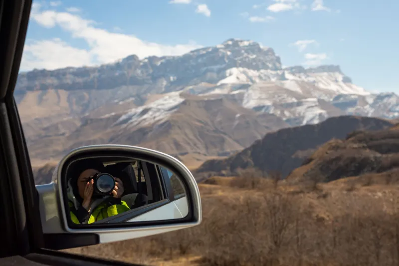
Goodbye Grand Canyon, Hello Gradient: The Quiet Revolution Happening on America's Screens

Photo by Photo by Luke Chesser on Unsplash on Unsplash
Open up a dozen phones at any coffee shop in Austin, Brooklyn, or Portland and you'll notice something interesting. The dramatic Rocky Mountain panoramas and sun-drenched Pacific Coast sunsets that dominated screens just a few years ago are disappearing. In their place? Soft lavender-to-teal gradients. Stark geometric grids. Abstract ink washes that don't quite look like anything at all.
This isn't a niche design-world thing anymore. It's happening everywhere, and it's worth asking why.
The Default Landscape Had a Good Run
For a long time, the scenic wallpaper was basically the unofficial American screen aesthetic. Apple helped cement it with those iconic Big Sur and Yosemite desktop backgrounds. Google pushed lush, saturated landscapes through Android's defaults. The message was implicit but powerful: your screen should feel like a window to somewhere beautiful and wild.
And honestly? It worked. There's real psychological research behind why humans respond to natural imagery. Restorative environment theory — the idea that exposure to nature, even simulated nature, reduces mental fatigue — gave scenic wallpapers a kind of wellness credibility. Putting a Montana meadow on your desktop felt productive, almost virtuous.
But somewhere around the early 2020s, the calculus started shifting.
When Escapism Stops Working
Here's the uncomfortable truth about scenic wallpapers in 2024: for a lot of Americans, they've started to feel like a taunt rather than a refuge.
You're grinding through a Tuesday afternoon Zoom call, inbox at 200 unread, and your wallpaper is a serene alpine lake with not a single human being in sight. The gap between that image and your actual life isn't soothing anymore — it's jarring. It's a reminder of everywhere you're not and everything you're not doing.
Abstract and minimalist wallpapers sidestep that problem entirely. A deep navy-to-indigo gradient doesn't promise you anything. It doesn't ask you to imagine yourself somewhere else. It just is — a visual field that complements your screen without competing with your headspace.
Design researchers call this "low-demand aesthetics" — visuals that engage the eye without triggering narrative or aspiration. And right now, low-demand is exactly what a lot of burned-out Americans are reaching for.
The Geometry of Modern Anxiety
There's another layer to this that goes beyond simple fatigue. The abstract wallpaper trend isn't just about tuning out — it's also about tuning in to something distinctly contemporary.
Geometric patterns and color-field abstractions feel honest in a way that pristine wilderness photography sometimes doesn't. They don't pretend the world is simpler than it is. A fractured Mondrian-style grid or a slowly shifting gradient feels more emotionally accurate to the experience of navigating modern American life than a stock-perfect shot of Zion National Park at golden hour.
There's also the social media dimension. Platforms like Pinterest and Instagram have been quietly amplifying abstract and minimalist aesthetics for years, but the wallpaper angle really started gaining traction on TikTok around 2022. Creators building "aesthetic setup" content — those satisfying videos of perfectly organized desks and color-coordinated workspaces — pushed abstract wallpapers into mainstream visibility. Suddenly, the right gradient wasn't just a background. It was a personality statement.
What Color Gradients Actually Signal
If you want to read the cultural mood of a generation, look at which colors are dominating the gradient trend. Right now it's a lot of muted purples, dusty blues, warm terracottas, and desaturated greens. Not the electric neons of the early 2010s. Not the cold grays of peak minimalism. Something softer, more ambiguous.
Color psychology folks would tell you these palettes signal a desire for calm without sterility — warmth without sentimentality. They're the visual equivalent of a deep breath. And that tracks with where a huge chunk of the American population seems to be emotionally: not looking for excitement, not fully retreating into numbness, but trying to find some sustainable middle ground.
The terracotta gradient, in particular, is doing interesting work. It nods to the American Southwest — to desert landscapes and adobe architecture — without actually being a landscape. It captures a geographic feeling while stripping away the representational baggage. You get the warmth of New Mexico without the implied vacation you're not taking.
Digital Wellness Is Reshaping Screen Aesthetics
The digital wellness movement deserves a lot of credit (or blame, depending on your perspective) for accelerating this shift. As more Americans have started actively managing their screen time and trying to reduce cognitive load, the idea of a "calming" wallpaper has evolved.
Old model: calming means nature. Mountains, forests, oceans.
New model: calming means visual simplicity. Clean color fields, minimal detail, nothing that pulls focus.
Apple's own wallpaper evolution reflects this. The macOS Sonoma and iOS 17 default options leaned heavily into abstract gradients and soft geometric forms. That's not an accident — Apple's design team is extraordinarily attuned to where user sentiment is heading, and they clearly read the room.
The Scenic Wallpaper Isn't Dead (Just Demoted)
None of this means America's landscape imagery is going anywhere. The Tetons aren't getting archived. But the cultural position of the scenic wallpaper is changing.
Where it was once the default, the automatic choice, the obvious answer to "what should go on my screen," it's now one option among many — and often a more deliberate, emotionally loaded one. People who still rock a dramatic Appalachian Trail sunrise or a Great Lakes shoreline at dusk are making a statement as much as the person who chose a minimal geometric pattern.
The difference is intentionality. The scenic wallpaper used to be the path of least resistance. Now it's a choice with meaning attached.
So What Does Your Abstract Wallpaper Say About You?
If you've quietly swapped your Blue Ridge Mountain vista for a soft gradient in the past year or two, you're not alone and you're not doing anything wrong. You're participating in a genuine cultural moment — one where Americans are renegotiating what they want their screens to reflect back at them.
Not escape. Not aspiration. Just a little breathing room.
And honestly? That's a pretty American response to an overwhelming moment. Practical, adaptive, and quietly creative. Even when the creativity looks like nothing more than a rectangle of shifting blue.
The wallpaper on your screen has always been a small, low-stakes way of saying something about who you are and what you need. Right now, a lot of us need something that asks nothing of us. A gradient does that pretty well.